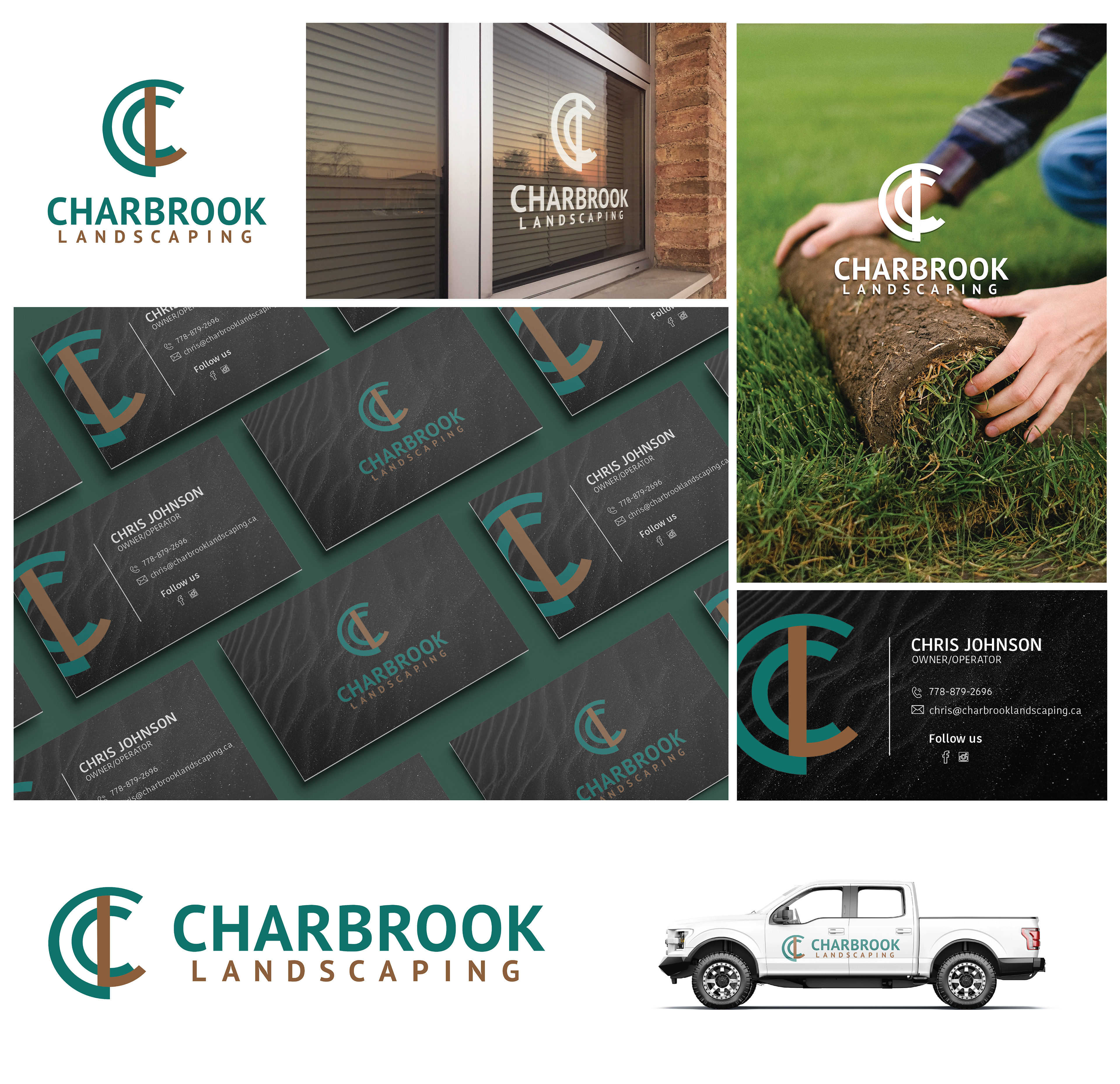
My client hired me to create a memorable logo for their new landscaping business; Charbrook Landscaping. Their goal is to provide quality landscaping and hardscaping services to their clients. They specialize in paving stones, walkways, retaining walls, and all hardscape, so I came up with a concept that incorporated the C & L along with a hardscaping fixture of the fountain which has the stone finish around the outside of the circular fountain, a type of hardscaping, as you can see in my ideation sketches below.
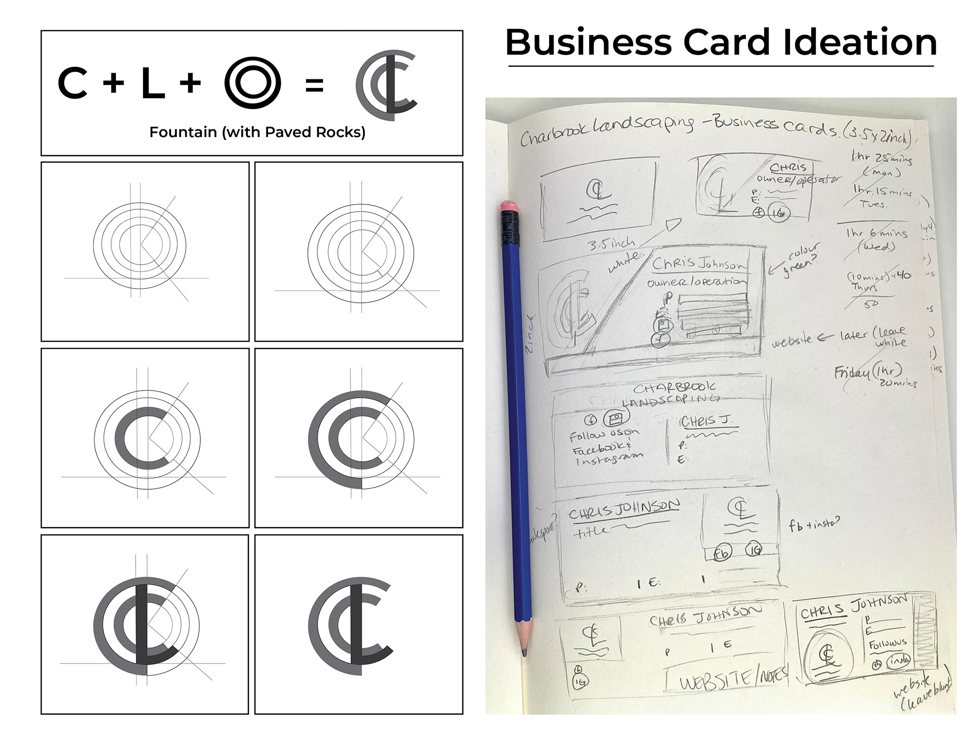
As they loved how their logo turned out, I was asked to also design business cards for their company as well so they could start promoting their business asap.
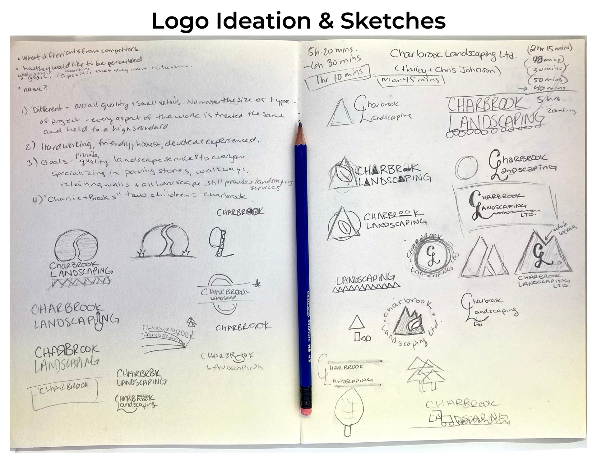
Explanation of final concept - For the final concept choice, I focused more on the hardscaping aspect of things. The icon/graphic is not only a combination of C & L for Charbrook Landscaping but it also echos the round hardscape projects such as would be found around a fountain - with the paving stones and rocks being built in there. It’s also unique in the sense that it’s geometric and simple. It’s not a common shape while bringing in the first two letters of Charbrook and Landscaping, meaning that overall it will be eye-catching, intriguing, and memorable for the client’s audience/potential customers.
This company is hardworking, friendly, honest, devoted, and experienced. They hold every aspect of the work to the same high standard. And they are concerned with the overall quality and small details in each project and that's what makes them stand out from their competitors. I took this into consideration when choosing the colour palette for Charbrook Landscaping's logo identity.
Colour theme - Because of the above words that described this company, I researched which colours would fit best. I wanted to bring in some sort of combination of brown, teal and/or green because the colour psychology works with how we wanted their clients to feel about the business.
Brown brings people/customers a feeling that the company is reliable, approachable, honest, natural/earth-friendly, and organic.
Green brings the growth aspect, stability, authenticity and again earth-friendly aspect.
We went with the green and brown colour palette. This works best for Charbrook Landscaping. I did love the trustworthiness that the teal/turquoise brought to the table, however, the combination we chose was the best for this company. The contrast in the brown/green is also an attention grabber which helps it stand out amidst its competitors.
See final design and mock-ups below: