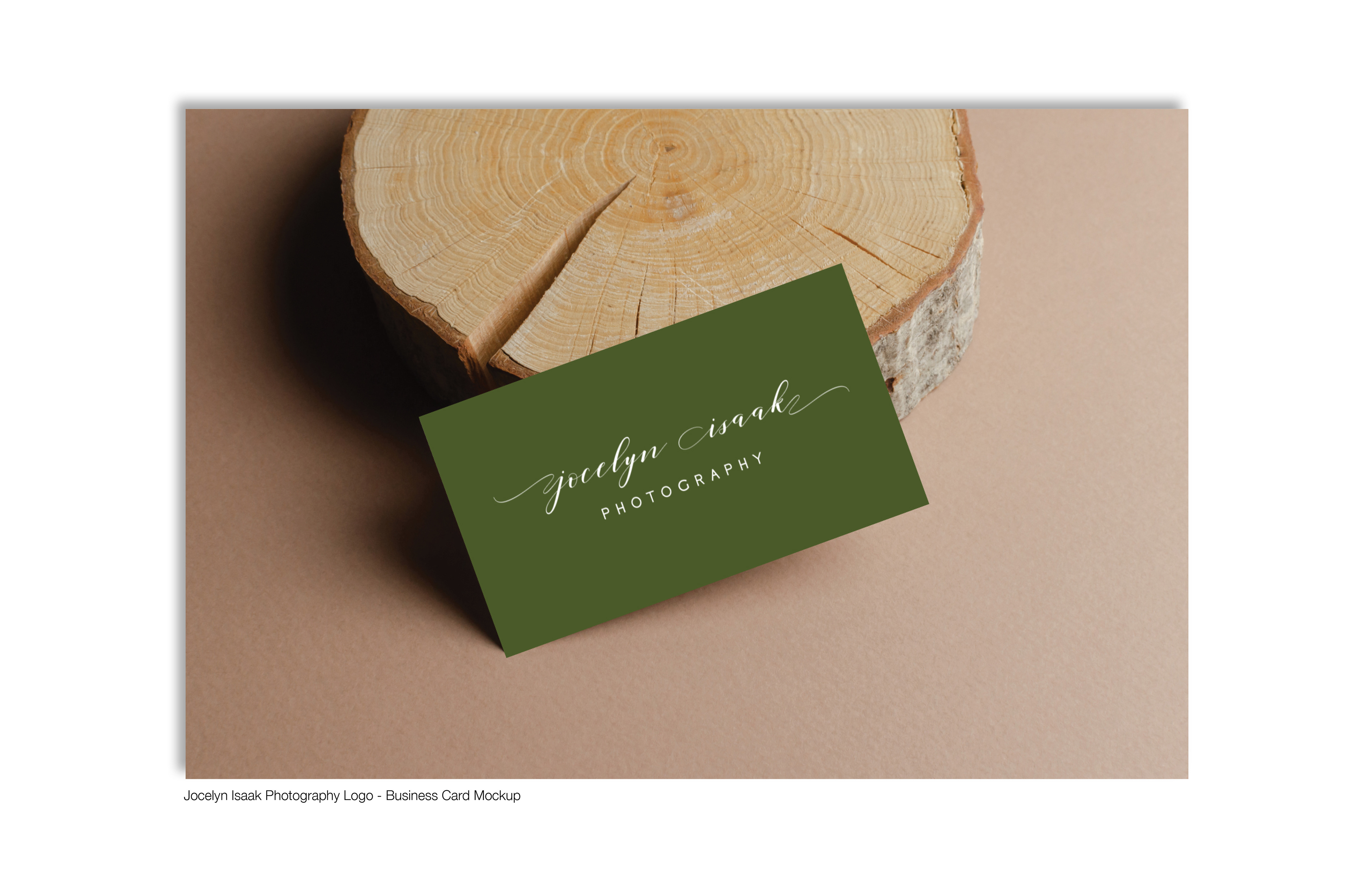
Jocelyn connected with me through Instagram in regards to designing a logo for her photography business. She didn't have a logo yet and a lot of people were asking her for business cards. She wanted a logo designed prior to creating business cards for her business/potential clients.
About Client: Jocelyn Isaak Photography is a photographer in the Fraser Valley that captures unique and special moments through photography. She is based out of Chilliwack but her sessions are captured anywhere between Abbotsford and Chilliwack. Jocelyn, the owner and photographer, specializes in families, weddings, and birth photography sessions. She loves to capture natural moments and connections. With a ton of experience under her belt, she found a love of photography when she got her hands on her first SLR camera. Find out more about her sessions and what she offers by visiting her website: jocelynisaakphotography.ca.
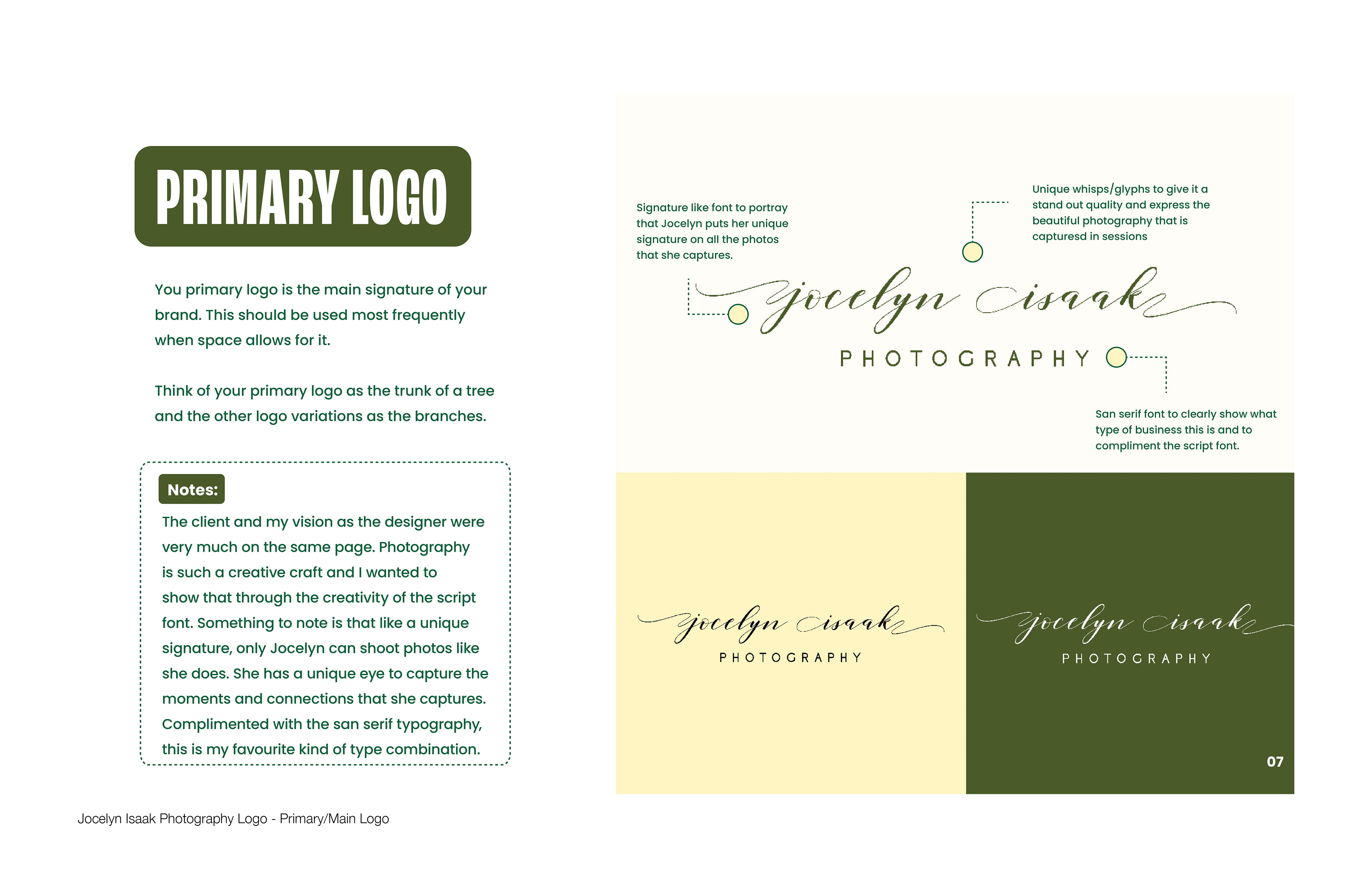
Logo Concept Direction: A combination of cursive script and san serif typography with a unique set of whisps/glyphs on both sides of the script font.
Primary Logo: The client and my vision as the designer were very much on the same page. Photography is such a creative craft and I wanted to show that through the creativity of the script font. Something to note is that like a unique signature, only Jocelyn can shoot photos like she does. She has a unique eye to capture the moments and connections that she captures. Complimented with the san serif typography, this is my favourite kind of type combination.
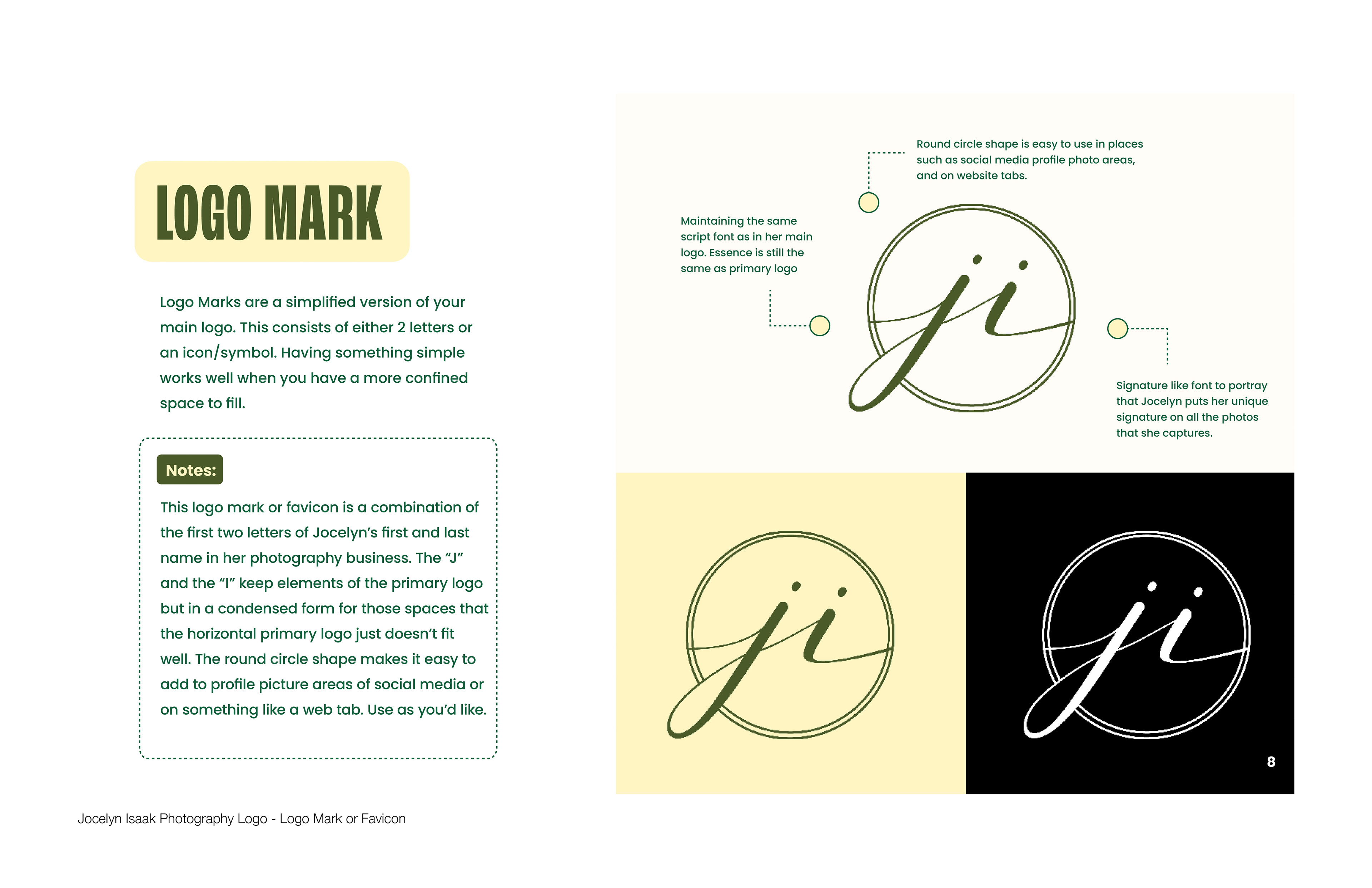
Logo Mark/Favicon: This logo mark or favicon is a combination of the first two letters of Jocelyn’s first and last name in her photography business. The “J” and the “I” keep elements of the primary logo but in a condensed form for those spaces where the horizontal primary logo just doesn’t fit well. The round circle shape makes it easy to add to profile picture areas of social media or on something like a web tab.
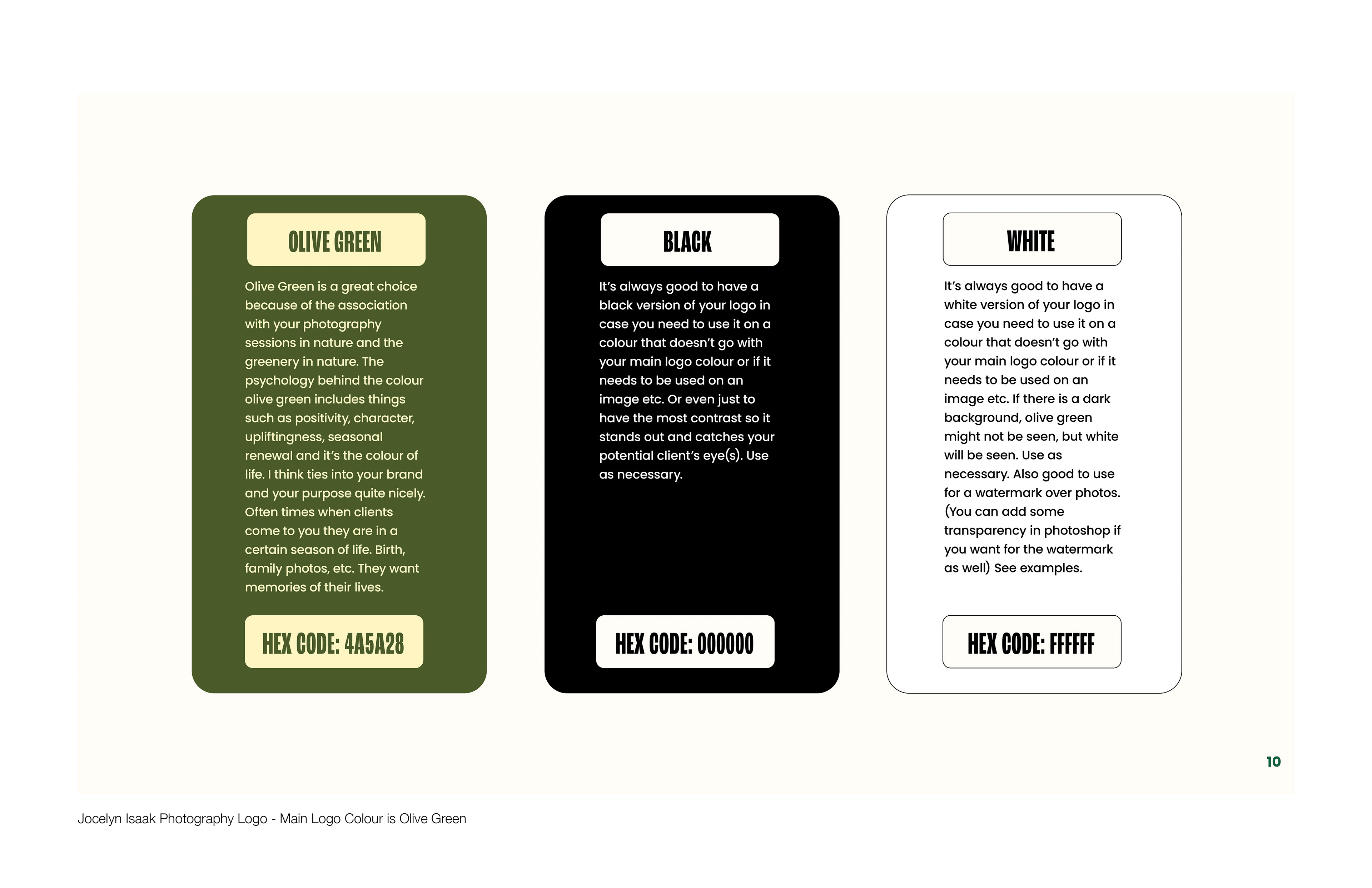
Logo Colour Direction: We ended up going with an Olive Green which is a great choice because of the association with her outdoor photography sessions and the greenery in nature. The psychology behind the colour olive green includes things such as positivity, character, upliftingness, seasonal renewal and it’s the colour of life. I think ties into her brand and purpose quite nicely. Often times when clients come to her they are in a certain season of life. Birth, family photos, etc. They want memories of their lives and green brings that aspect of growth/life season as well.
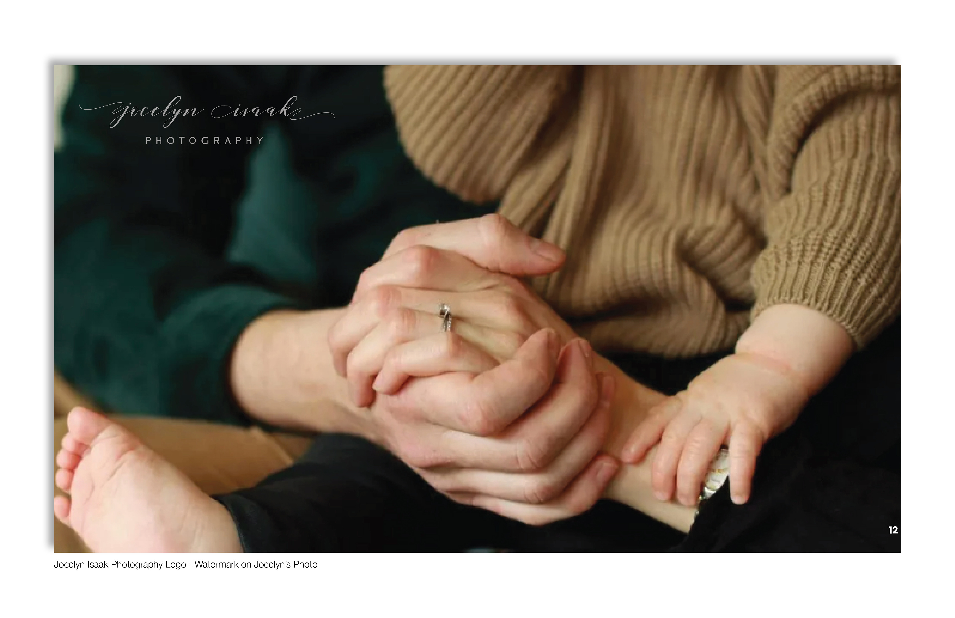
There are always areas to use black and white logos but I wanted to point out that the use of the white version of her logo would make a wonderful watermark for her photographs.